Top 10 Canva hacks for beginners (step by step)
1. Start with the right template then make it yours
Why it matters: Templates give you layout, spacing and hierarchy instantly but a sloppy edit still looks amateur. Customising a template gives you speed and style.
Step by step:
Open Canva and type the project type in the search bar (e.g. “Instagram post”, “A4 poster”).
Browse templates and pick one that matches your layout. Don’t worry about colours or fonts. Focus on structure.
Click the template to open it. Replace placeholder text by double clicking any text box and typing your copy.
Replace images by selecting an image and choosing Replace image (or drag an image from the left‑hand panel).
Match the template to your brand: change fonts and colours (see Hack 2).
Delete any unnecessary elements and tidy spacing with Position → Tidy up.
Pro tip: If you love the layout but not the fonts, change all text boxes to a single heading/subheading/body style so your typography stays consistent.
2. Use a Brand Kit or build a mini one manually
Why it matters: Consistent colours and fonts make designs look intentional and professional.
Step by step (Brand Kit):
Open the left menu and click Brand (or Brand Kit).
Add your brand colours by pasting hex codes or using the colour picker.
Upload brand fonts or choose from Canva’s font list and set heading/body styles.
Apply these to your designs via the colour and font menus.
If you don’t have Brand Kit (free users):
Create a small one page template in Canva containing a swatch of your colours and text boxes with your chosen fonts.
Duplicate that page whenever you start a new design so you’ve got quick access to your brand assets.
Pro tip: Save your most used colour as a document colour so it’s always one click away.
3. Use grids, frames and rulers to keep layouts neat
Why it matters: Grids and rulers give clean alignment and professional spacing without guesswork.
Step by step:
In the left panel choose Elements → search for Grids or Frames.
Drag a grid onto the canvas to create equal image placements.
Drop images into frames they’ll auto mask to the shape.
Turn on rulers and guides from the File menu (or View options) to set margins and columns.
Use Position → Align and Tidy up to even out spacing.
Pro tip: Use a 12 column mental grid for most layouts. It helps when you want balanced asymmetry.
4. Speed up with keyboard shortcuts & selection tricks
Why it matters: Shortcuts shave minutes off repetitive tasks and keep your flow.
Essential shortcuts: Duplicate selected element (Ctrl/Cmd + D), group (Ctrl/Cmd + G), ungroup (Ctrl/Cmd + Shift + G), copy/paste (Ctrl/Cmd + C / V).
Step by step selection tricks:
Click and drag to multi select multiple elements, then use Group to move them as one.
Lock elements you don’t want to move (select → click the three dots → Lock).
Use arrow keys to nudge; hold Shift while nudging to move in bigger steps.
Pro tip: Duplicate an element and then change the duplicate (instead of recreating) to keep spacing exactly the same.
5. Give text more punch with Effects (shadow, lift, curve)
Why it matters: Text effects can turn basic copy into a striking headline without complex editing.
Step by step:
Select a text box and click Effects in the top toolbar.
Try Shadow, Lift, Hollow, or Splice to add depth and contrast.
For more personality, use Curve to bend text (adjust the slider for subtlety).
Balance effects heavier effects for short headlines, subtler for body text.
Pro tip: Use a semi transparent shadow (around 30–40%) rather than full black, softer looks more modern.
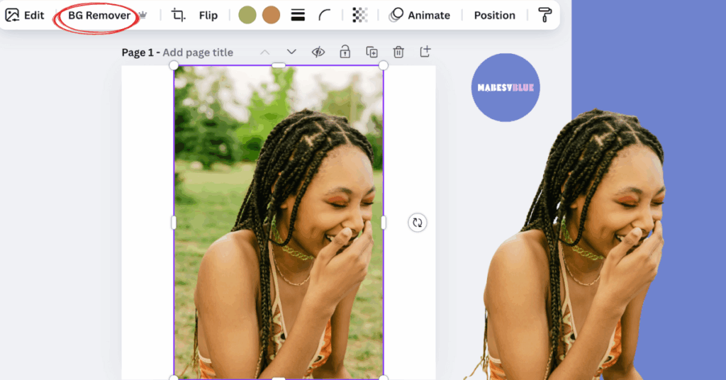
6. Remove backgrounds (alternative tricks if you don’t have Pro)
Why it matters: A clean background makes logos, portraits and product shots look professional.
Step by step (Background Remover):
Upload or select an image.
Click Edit image → Background Remover. Canva will isolate the subject.
Use the Erase/Restore brushes to refine edges.
Workaround for free users:
Use Frames to mask your subject into a shape that hides the busy background.
Or use a coloured block behind your subject and lower the image transparency for a stylised look.
Pro tip: After removing the background, add a subtle drop shadow to ground the subject.
7. Resize quickly for different platforms (Magic Resize and manual method)
Why it matters: One design repurposed across platforms saves time and keeps your brand consistent.
Step by step (Magic Resize Pro):
With your design open, click Resize in the top bar.
Choose the formats you need (Instagram post, story, A4 etc.) and click Copy & resize.
Tweak each new copy. Images and text may need slight repositioning.
Manual method (free users):
Duplicate the design page (page menu → Duplicate page).
Change the canvas size (File → Change dimensions or start a new document with the target size).
Copy/paste elements from the original and use grids to reposition.
Pro tip: Start with the most constrained format first (e.g. Instagram story) this forces you to simplify the design, which then scales up better.
8. Master photo adjustments and filters for consistent imagery
Why it matters: Consistent colour and exposure across images keeps your feed cohesive.
Step by step:
Select an image and click Edit image → Adjust.
Tweak Brightness, Contrast, Saturation and Warmth to match your brand look.
Save a look by noting values or use the same filter on all images for consistency.
Try Duotone or film like filters for a distinctive, cohesive vibe.
Pro tip: Apply subtle contrast and slightly lower saturation for a modern, calming aesthetic.
9. Build reusable templates and organise your files
Why it matters: Reusable templates and tidy folders turn a one off project into a repeatable system.
Step by step:
After finalising a design, click the three dots at the top and choose Make a template (or duplicate the file and rename).
Create folders for campaigns, clients or platforms and move designs into them.
Name files consistently: YYYY‑MM‑DD_platform_campaign. This will make searching a breeze.
Create a simple cover page that documents font sizes and hex colours for each template.
Pro tip: Keep a short naming convention cheat sheet with you so collaborators can follow the same system.
10. Add subtle motion. Animate and export correctly
Why it matters: Motion draws attention. A small animation can lift a static design for social.
Step by step:
Select an element or a whole page and click Animate in the top toolbar.
Try page animations for entrances (e.g. Pan, Rise) or element animations for isolated movement.
Preview using the play icon; dial back intensity for a tasteful effect.
Export: choose MP4 video or GIF depending on platform. For Instagram, MP4 is usually best.
Pro tip: Use very subtle animation for branded content. Slow fades and soft slides look more professional than frantic motion.
Final checklist for beginners
Use templates but customise fonts and colours.
Keep assets organised in folders and name files sensibly.
Save time with shortcuts, grouping and duplication.
Decide a consistent image look (adjustments/filters) before you design.
Export the correct file type for your platform (PNG for graphics, MP4 for motion).